Thursday 14 April 2011

Diary Entry Week 7

In this week I finished my final drafts for my magazine. This involved me taking new images for the front cover, contents page and my double page spread. I used a low angle shot for my front cover with all of the band members in instead of taking them individually.

I was also continuing to complete my media evaluation which required me to plan out some of my questions which I am going to complete for a couple of weeks time. This will make me be able to compare my audience research, and other aspects with real magazines which is my style model i.e. NME.

I changed many things for my final drafts which included text positions, images, and the general layout of all three pages of my magazine.

Final Draft - Double Page Spread

Final Draft - Contents Page

Final Draft - Front Cover

Technical Guidance

My skills:

  •  Move Tool – This allows me to drag my images / text and shapes around allowing me to edit my magazine in more detail making the finished product more professional and better to look at.

  •  Hand Tool – This allows me to drag my view of my magazine to different areas allowing me to have a closer look at all of my work so I could sort out slight differences.

  •  Eyedropper Tool – This allows me to pick different colour which I have already used to allow me to have a constant colour scheme throughout my magazine.

  •  Magnetic Lasso Tool – This allows me to cut out shapes which have a different colour contrast to them. This made cutting out people easier.

  •  Magic Wand Tool – This allows me to select different areas of an image and delete it to clear a background allowing me to use it on my magazine.

  •  Text Tool – This allows me to create text and place it any where on my pages. It allows me to choose from a number of fonts and sizes as well as colours.

  •  Crop Tool – This helps to reduce the size of an image making it easier to cut out or helping it reach a certain size or shape.

  •  Spot Healing Brush Tool – This will help me remove the spots on people’s faces leaving a more professional look to my magazine.

  •  Clone Stamp Tool – This clones certain aspects of my magazine allowing me to smooth over bits which were too rough.

  •  Eraser Tool – This allows me to erase certain bits of image out and smooth out the edges of my images making them appear more professional.

  •  Paint Bucket Tool – This allowed me to change the colour of fonts and other shapes by using this tool and selecting a colour to use.

  • Custom Shape Tool – I used this to draw the banners for my front page and double page. I also used this to draw the rectangles for all of my pages.

New - Images used in Music Magazine


Tuesday 12 April 2011

Diary Entry Week 6

In week 6 I began to create my final draft by using my teachers and fellow pupil’s advice and began to improve my rough cuts. This meant that I could use people’s feedback to improve my magazine and my grade. We also began the evaluation allowed us to view what we had to do and how to answer the questions.

When analysing the evaluation we looked at previous examples which were marked very highly. This gave us an insight to what we had to do to get a similar mark to what they examples had. We also analysed the evaluation task trying to figure out how we could answer all of the questions to a high standard. This would be helpful when it comes to completing this task as it gives us preparation for when we complete the task properly.

Monday 11 April 2011

Diary Entry Week 5

In week five of this media project I was continuing to work on my rough cuts for the magazine. I had edited some things from my sketches for my magazine which I though improved the look of my magazine. I had designed a front cover, contents page and double page spread which would resemble the base of my final magazine. After completing this rough cut for my magazine, it was analysed by my teachers and students which told me what they liked about my magazine and what they didn’t like about my magazine.

After I received my feedback I wrote it up and decided what I would do to improve my rough cuts to achieve the highest grade possible for my final draft. I was told to do many things to improve my magazine including taking new photos for my front cover and adding more images onto my contents page.

Critical Analysis

Teachers Review

Likes

FC – Bold title, clear focus on the main article and colour scheme.

Contents – Contents list is easy to read, good layout and colour scheme.

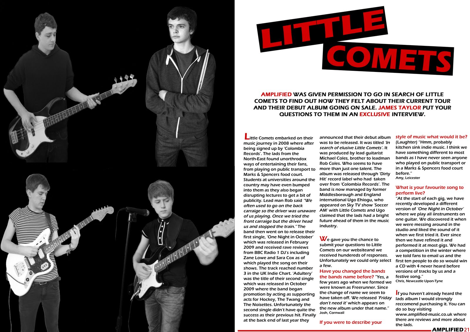
DPS – Great photos,  strong layout, good use of colour in the text, good branding, colour scheme, font for band name and name and page number.

Dislikes

FC – Lighting is too dark (x2), bar code is too big, Leeds ticket doesn’t work, take a picture of the band together, unsure about stories at the top of the page, background too plain.

Contents – More photos, smaller advert (x2), too much small text at the bottom, bottom image is too dark, no page number next to top image.

DPS – Put a line in between images, add caption to image, look for a better font for the title, match title with the style of the image.

Overview of Improvements

Based on my teacher’s analysis I am going to improve my magazine I am going to retake the photos for my front cover. I am also going to play about with the Leeds ticket competition on the front cover which does not look very good. I am also going to play around with the article title’s which I am going to remove at the top pf the page.

For my contents page I am going to retake my photos, make my advert smaller, add a page number to one of my images.

For my DPS I will put a line in between images, add a caption to my image and try different fonts for the title.

Students Review

Likes

FC – Bold headline (x3), good photo (x2), photo links well with magazine, clear text, good strap line (x2), Amplified logo is good (x4), good font used, good use of boxes for text, good colour scheme (x3), good layout.

Contents – Good structure (x5), Good Sub-Headings, Article Font, Good Images (x3), Colour Scheme (x2), Good Title.

DPS – Drop Capital, Good Layout (x5), Good Sub-Headings, Good Column, Like Little Comets Title, Good Page Number, Colour Scheme (x2), Good Images (x5), Good Text Layout.

Dislikes
FC – More Detail could be added, Dark Photo (x4), Need a background (x2), too simple, Less Edited Images, Images seem separate, Make Price Smaller.

Contents – Too much text on the black text
boxes (x2)
, Bottom left image, Too many Guitar Images, Too much text, Background Needed (x2), Different Images, Too much detail.

DPS – Clearer Images, Put the name of the person who asked the question after the question not the answer, Can’t see the microphone, Image, Less Guitars (x2), More Questions,

Overview of Improvements

The students who reviewed my work so far also suggested some improvements which I could do to improve my work so far. For my front cover a large amount of people said that my images were too dark and I should either retake the photos or do something to improve it. People also said that I should have a background for the front cover also. Students suggested I should make the price of my magazine smaller and add more detail to my front cover.

For my contents page I was asked to take some text off my black boxes for the editor’s column and add a background to the page. I have also been advised to add different and more images to my contents page.

For my double page spread some people said that I should have less images with guitars in which would mean that I would have to retake the photos for my whole magazine. I was also advised to make my images brighter, add more questions and move the name of the person who asked the question after the question rather than after the answer.

Rough Cut - Double Page Spread

Rough Cut - Contents Page

Rough Cut - Front Cover

Diary Entry Week 4

In week four of the music magazine project we began designing our rough cuts of our magazine from the ideas based around our hand drawn designs. I feel they helped me decide the basic outline of my magazine allowing me to edit aspects that I thought I could improve on the computer. I have copied my hand drawn design on the computer and changed certain aspects. I have selected the font I am going to use for both headings and small text.

I have organised my photographs to be taken at the weekend which will then be uploaded onto my rough cuts allowing me to move my text around my images. I feel that once the images have been uploaded onto my designs they will begin to look better and look more like a real magazine. This week I have designed my front cover and began to design my contents page and so far all is going well. The designs resemble the idea in my head and on the hand drawn designs well and hope they look professional.

Monday 28 March 2011

Original Images


Picture Planning

Picture
Time and date
Model / pose / costume
Location
Lighting
Set-up time
Mise-en-scene
Camera angle and distance
1
20/3/2011
Male turning his head away from the camera.
My house
Natural
Normal facial expression, stripy t-shirt, dark jeans.
Medium shot.
2
20/3/2011
Male with hands behind back looking straight down the camera lens.
My house
Natural
Normal facial expression, polo shirt, blue jeans.
Medium shot.
3
20/3/2011
Male with arms folded, looking at the camera.
My house
Natural
Normal facial expression, blue hoody, red t-shirt, blue jeans.
Medium shot.
4
20/3/2011
Male playing guitar with amplifier
My house
Natural
Concentrating on chords, stripy t-shirt, dark jeans.
Medium shot.
5
20/3/2011
Male, playing guitar with microphone.
My house
Natural
Concentrated face on chords playing, polo shirt, blue jeans.
Medium shot.
6
20/3/2011
Two Males, one holding guitar, the other with a microphone. Having a conversation.
My house
Natural
Normal facial expressions having conversation. Polo shirt and blue jeans, stripy t-shirt and blue jeans.
Medium Two Shot.
7
21/3/2011
Male holding drumsticks with arms folded.
My house
Natural
Normal face, looking away from the camera, blue hoody, red t-shirt and blue jeans.
Medium shot.
8
24/3/2011
Male with Bass Guitar, playing chords
School
Natural
Normal facial expression, Black hoody, dark jeans.
Medium shot.
9
24/3/2011
Male with hands in pockets, looking at the camera.
School
Natural
Normal facial expression, black hoody, dark jeans.
Medium shot.
10
28/3/2011
Male close up for the editors review section
School
Natural
Smiling, t-shirt
Close up.