Teachers Review
Likes
FC – Bold title, clear focus on the main article and colour scheme.
Contents – Contents list is easy to read, good layout and colour scheme.
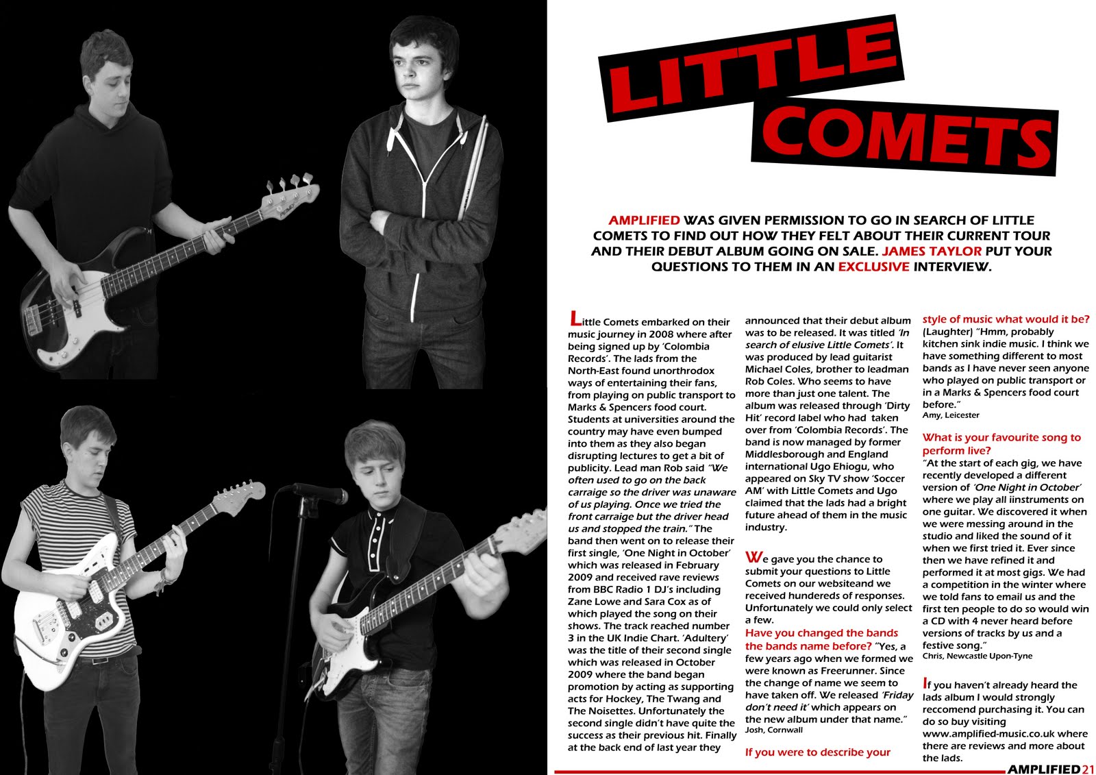
DPS – Great photos, strong layout, good use of colour in the text, good branding, colour scheme, font for band name and name and page number.
Dislikes
FC – Lighting is too dark (x2), bar code is too big, Leeds ticket doesn’t work, take a picture of the band together, unsure about stories at the top of the page, background too plain.
Contents – More photos, smaller advert (x2), too much small text at the bottom, bottom image is too dark, no page number next to top image.
DPS – Put a line in between images, add caption to image, look for a better font for the title, match title with the style of the image.
Overview of Improvements
Based on my teacher’s analysis I am going to improve my magazine I am going to retake the photos for my front cover. I am also going to play about with the Leeds ticket competition on the front cover which does not look very good. I am also going to play around with the article title’s which I am going to remove at the top pf the page.
For my contents page I am going to retake my photos, make my advert smaller, add a page number to one of my images.
For my DPS I will put a line in between images, add a caption to my image and try different fonts for the title.
Students Review
Likes
FC – Bold headline (x3), good photo (x2), photo links well with magazine, clear text, good strap line (x2), Amplified logo is good (x4), good font used, good use of boxes for text, good colour scheme (x3), good layout.
Contents – Good structure (x5), Good Sub-Headings, Article Font, Good Images (x3), Colour Scheme (x2), Good Title.
DPS – Drop Capital, Good Layout (x5), Good Sub-Headings, Good Column, Like Little Comets Title, Good Page Number, Colour Scheme (x2), Good Images (x5), Good Text Layout.
Dislikes
FC – More Detail could be added, Dark Photo (x4), Need a background (x2), too simple, Less Edited Images, Images seem separate, Make Price Smaller.
Contents – Too much text on the black text boxes (x2), Bottom left image, Too many Guitar Images, Too much text, Background Needed (x2), Different Images, Too much detail.
DPS – Clearer Images, Put the name of the person who asked the question after the question not the answer, Can’t see the microphone, Image, Less Guitars (x2), More Questions,
Overview of Improvements
The students who reviewed my work so far also suggested some improvements which I could do to improve my work so far. For my front cover a large amount of people said that my images were too dark and I should either retake the photos or do something to improve it. People also said that I should have a background for the front cover also. Students suggested I should make the price of my magazine smaller and add more detail to my front cover.
For my contents page I was asked to take some text off my black boxes for the editor’s column and add a background to the page. I have also been advised to add different and more images to my contents page.
For my double page spread some people said that I should have less images with guitars in which would mean that I would have to retake the photos for my whole magazine. I was also advised to make my images brighter, add more questions and move the name of the person who asked the question after the question rather than after the answer.